Coonect talent matchmaking platform
A cleaner way to hire. Coonect bridges the gap between companies and candidates with a platform built for simplicity, speed, and confidence from the first search to the final interview.
Introduction: Bridging the gap in hiring
The hiring process should be about value and engagement, but it’s not for companies and candidates. It is fragmented, inefficient, and frustrating. Companies spend hours trying to find the right candidate, while candidates struggle to stand out and often receive no feedback at all.
Coonect was created as a response to this challenge. It’s not just another recruitment platform, but an opportunity to design a more human hiring experience. Our task was to rethink the hiring journey from both the candidate’s and the employer’s side, through targeted research and co-creation, to deliver a tool that offers a single platform that understands both people and processes.
The goal was to eliminate the noise and create a solution that breathes simplicity, speed, and trust.

My role on Coonnect
As the lead UX/UI designer on Coonnect, I owned the platform’s visual identity, style application, and client-facing design alignment:
- Design system creation
Crafted a comprehensive component library buttons, inputs, cards, charts, complete with spacing, states, and behavior guidelines to ensure consistency and scalability. - Brand & style development
Defined the color palette, typography hierarchy, iconography style, and grid system. Every style decision was documented so the interface always feels cohesive. - Discovery Workshops & Presentations
Run discovery sessions with stakeholders to validate requirements and led regular design reviews, presenting flows, mockups, and style proposals to keep everyone aligned.
Through these efforts, I ensured Coonnect not only functioned intuitively but also felt uniquely on-brand and visually engaging.
Users and their needs
Although the platform supports both sides, our primary focus was on recruiters, as they are the ones taking the first step. Their most vital request is to quickly identify relevant candidates, compare them meaningfully, and make decisions based on data and intuition.
On the other end, candidates wanted transparency and a sense of control over the process.
Our challenge was to build a unified solution that meets the needs of both sides in a system where every step is designed to reduce complexity, speed up decision-making, and improve the quality of the final match.
Design process: innovation through
proven patterns
Our design process didn’t start with shiny deliverables, but with a co-creation workshop and a clear philosophy: we will never reinvent the wheel. Instead of blindly solving an existing HR tool, our approach was to run thorough user and client interviews paired with deep analysis of how existing top products behave.
Through a series of workshops, we produced a series of role prototypes, UI direction iterations and smart reuse models. We selected data that best reflects the goals and enhances understandability. This is why we reused the “importance scale” for HR context, derived from tested modules, comparable lists from e-commerce platforms, and communication patterns from marketplace apps.
Onboarding that guides, not pushes
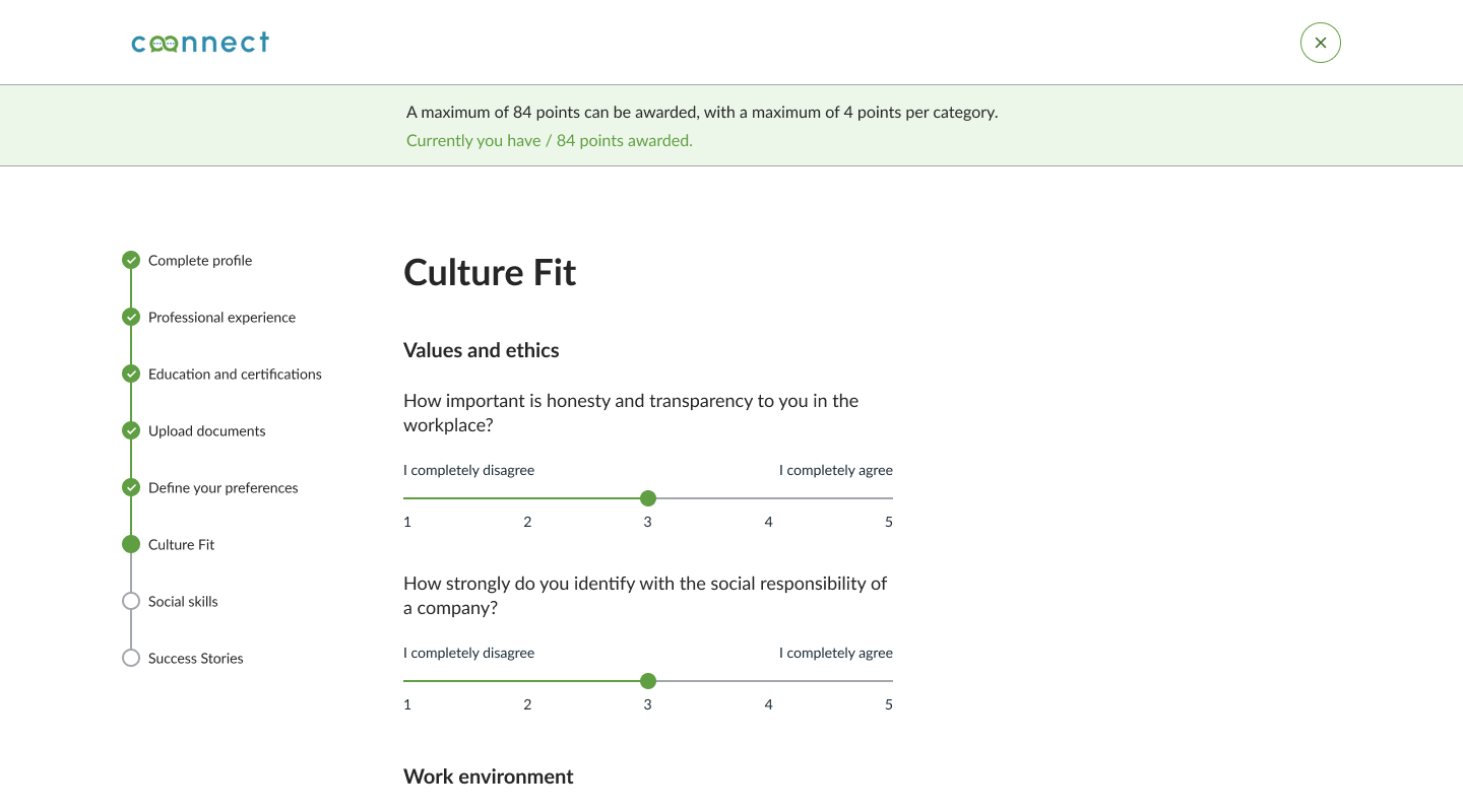
The profile builds through 8 clear steps, each enhanced with contextual help and visual feedback:
- Step progress
A prominent header shows “Step X of 8,” so users always know where they are and how many steps remain. - Thoughtful scoring
1–5 rating scales for Culture Fit and Social Skills. Users have a maximum of 84 points to distribute across Culture Fit and Social Skills, ensuring they reflect carefully instead of maxing out every category. - Contextual tips
Each step includes a brief note or illustration explaining why the question matters and how answers influence the profile. - Auto-save & resume
Progress is saved automatically at each step, allowing users to pause and pick up exactly where they left off.
Intuitive search inspired by daily habits
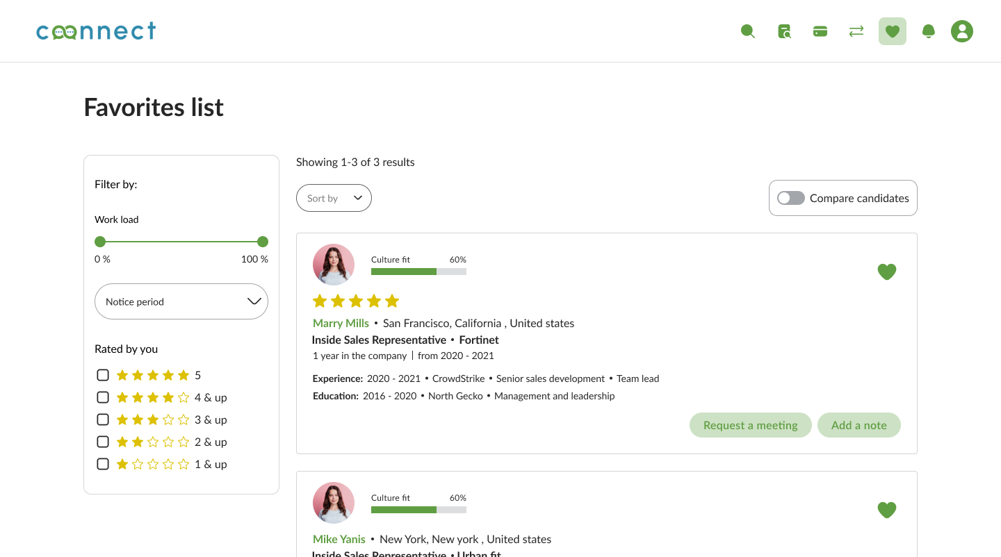
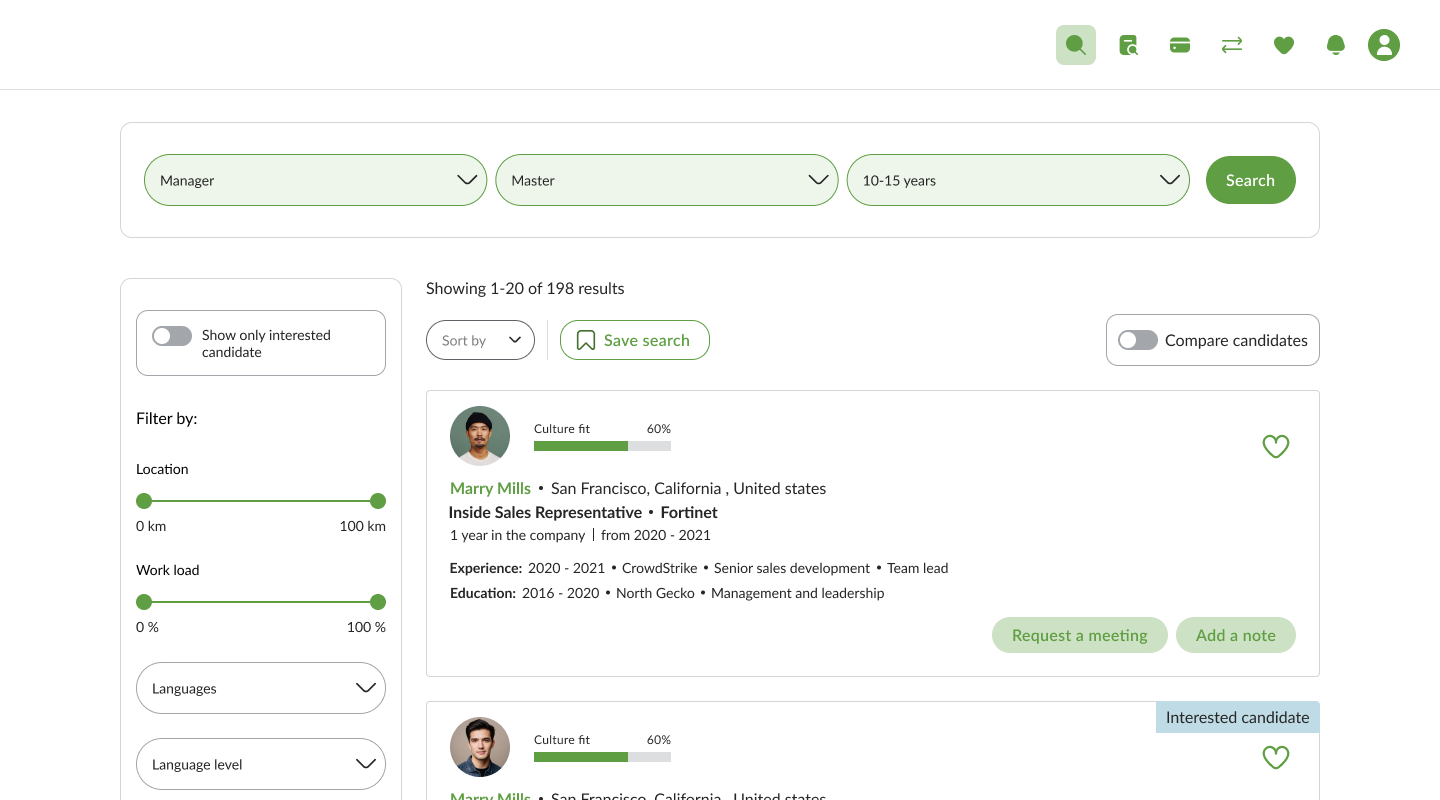
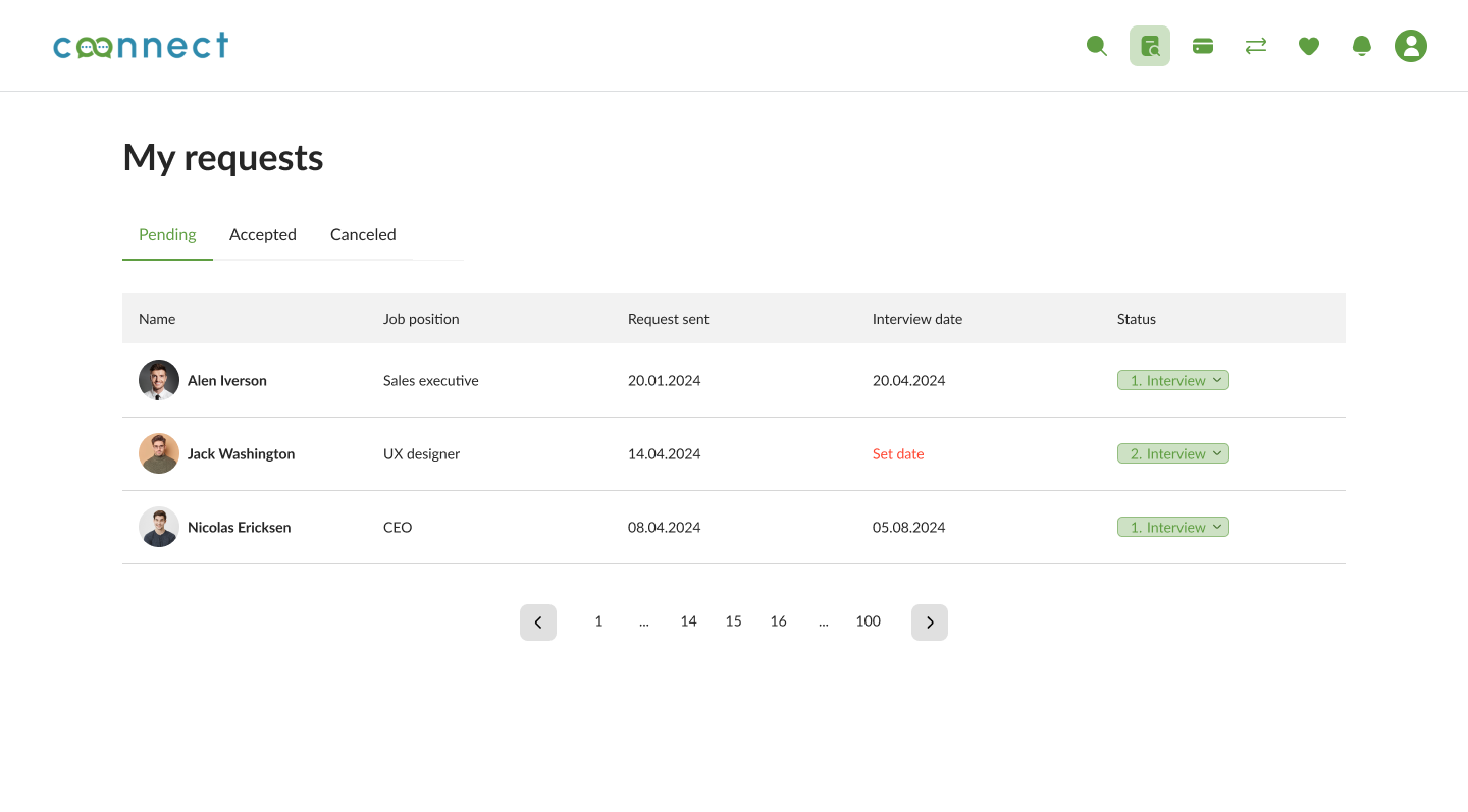
The candidate search module was designed based on patterns people use every day. The goal was not to teach recruiters a new tool but to actively guide them to what works. We enabled access to every choice from the search result itself via functions, notes & labels, invite to team, and the ability to save successful browsing routines when work in multiple tabs and directions.
Comparison view: clarity over raw data
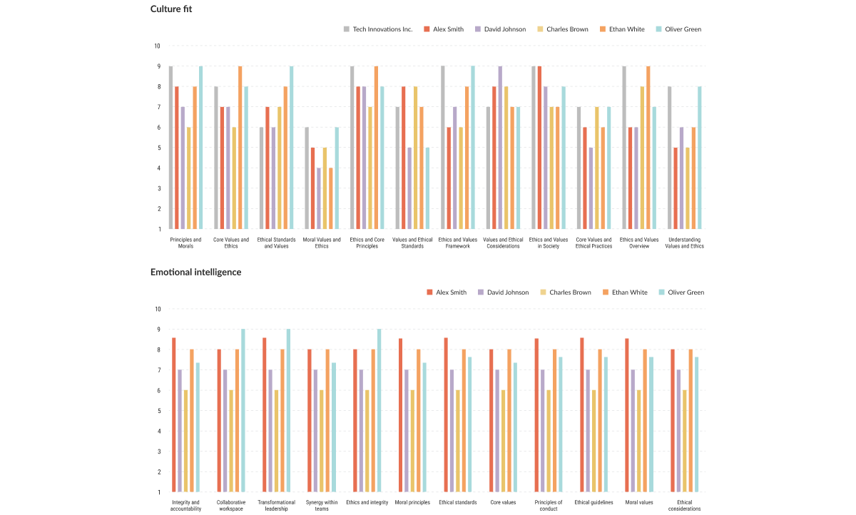
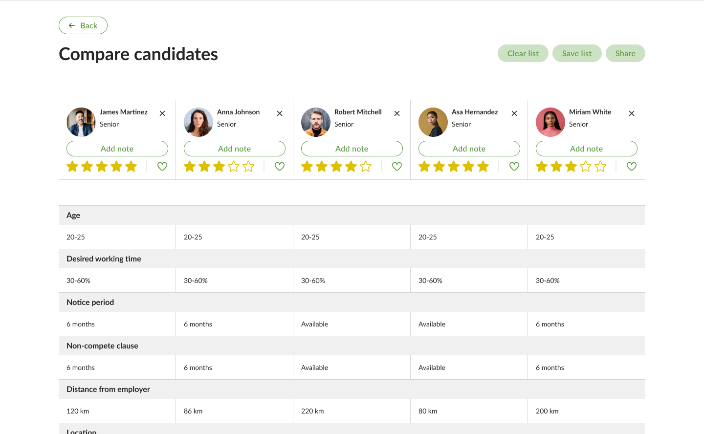
When comparing candidates, we wanted to strip data to its core. Our users tend to have medium attention span, not just numbers. We created a side-by-side view for up to 5 candidates, useful for comparing features like business fit, mindset, and professional skills. Although users initially requested the ability to compare up to 10 candidates, user testing showed that anything beyond 5 causes cognitive overload.
Lessons learned
One of the biggest insights from this project was that the best UX solutions arise when we first ask who the recruiter you’re designing for is. We knew the strategy of supporting time-limited recruiters through clear context and then flexible transitions was the key to frictionless interaction. I learned that a designer doesn’t need to reinvent the wheel every time, but to recognize what already works and know how to apply it to serve real users.